Brand Identity | Packaging
CLIENT | Personal Project
Splash
Fruit Drink Brand
.01
bACKGROUND
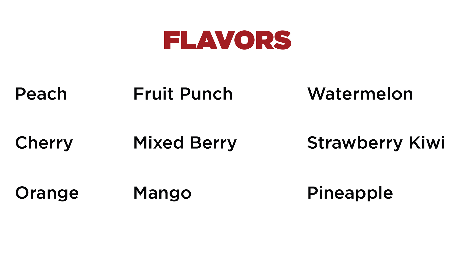
Splash is a fictional fruit juice brand based in the US. This product is sold in stores, restaurants, and vending machines. Splash is pack with flavor and electrolights. It’s sure to refresh you on a hot summer day. The target market is youth and young adults. This drink comes in many flavors one of which is the featured Pineapple flavor. For this project, I put most of my focus on the hand lettering of the logo design. I also created an overall brand identity and package design.
.02
Challenge
The challenge of this project was to create a logo and brand identity that emphasizes youth, energy, and the strong flavor of the drink. Since this brand is fun and youthful, the logo needs to convey a playful nature.
.01
Color + Typography
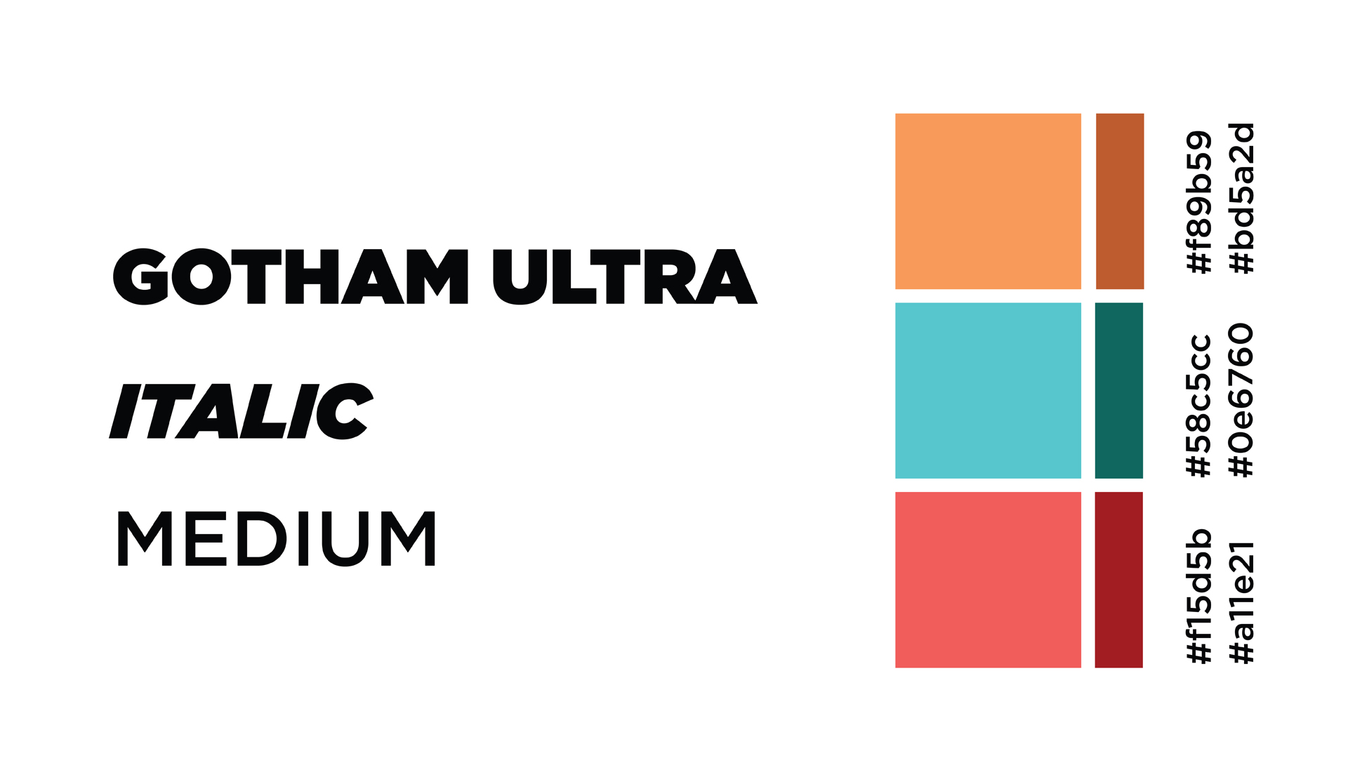
I chose Gotham due to the round bold style. This represents the intense and bold flavor of the drink while also feeling fun and youthful. The colors similarly are bright and intense to represent the drink and stand out to the young target audience. The colors also very warm giving feelings of summer and fun. This drink is perfect for a hot summer day.


.02
Logo Mark
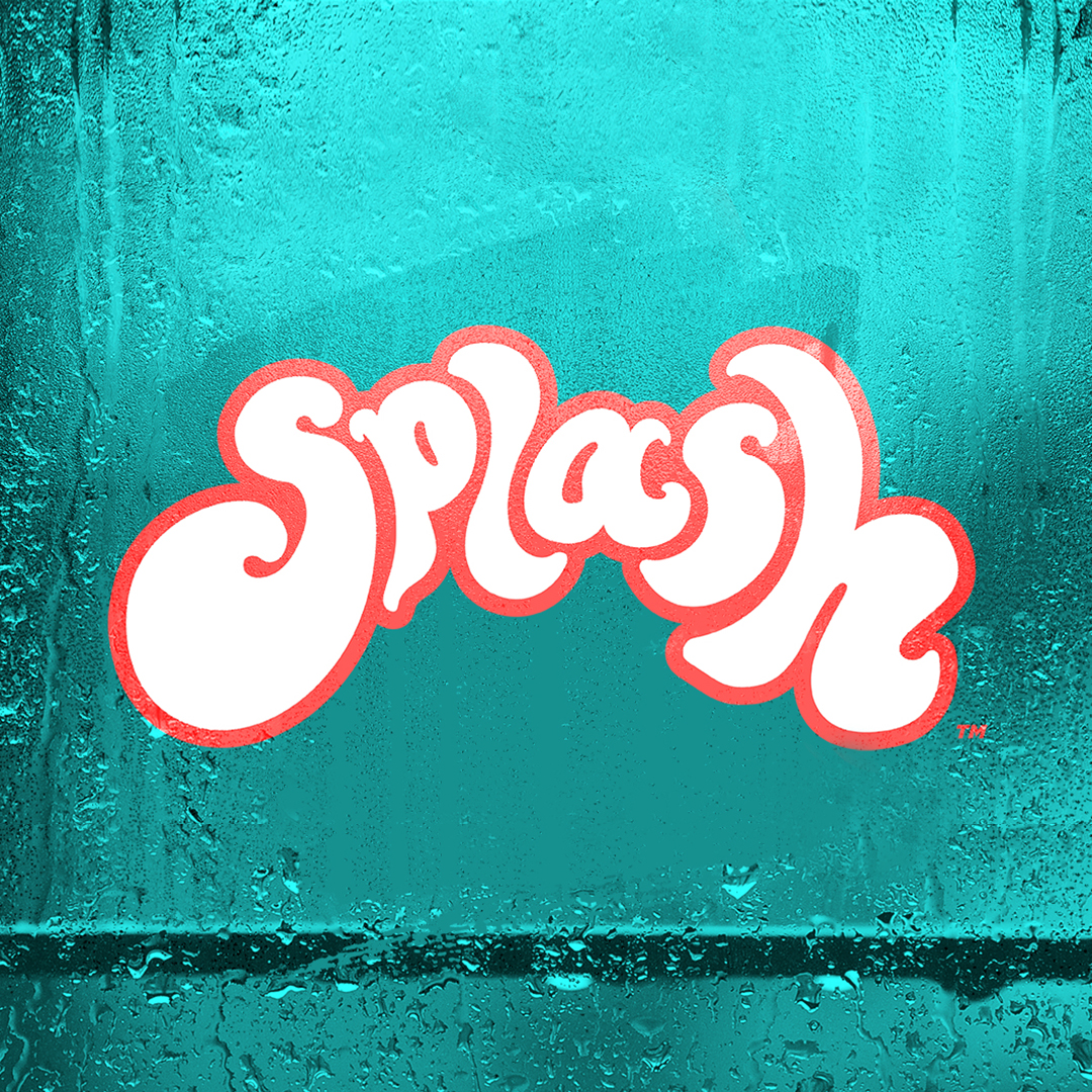
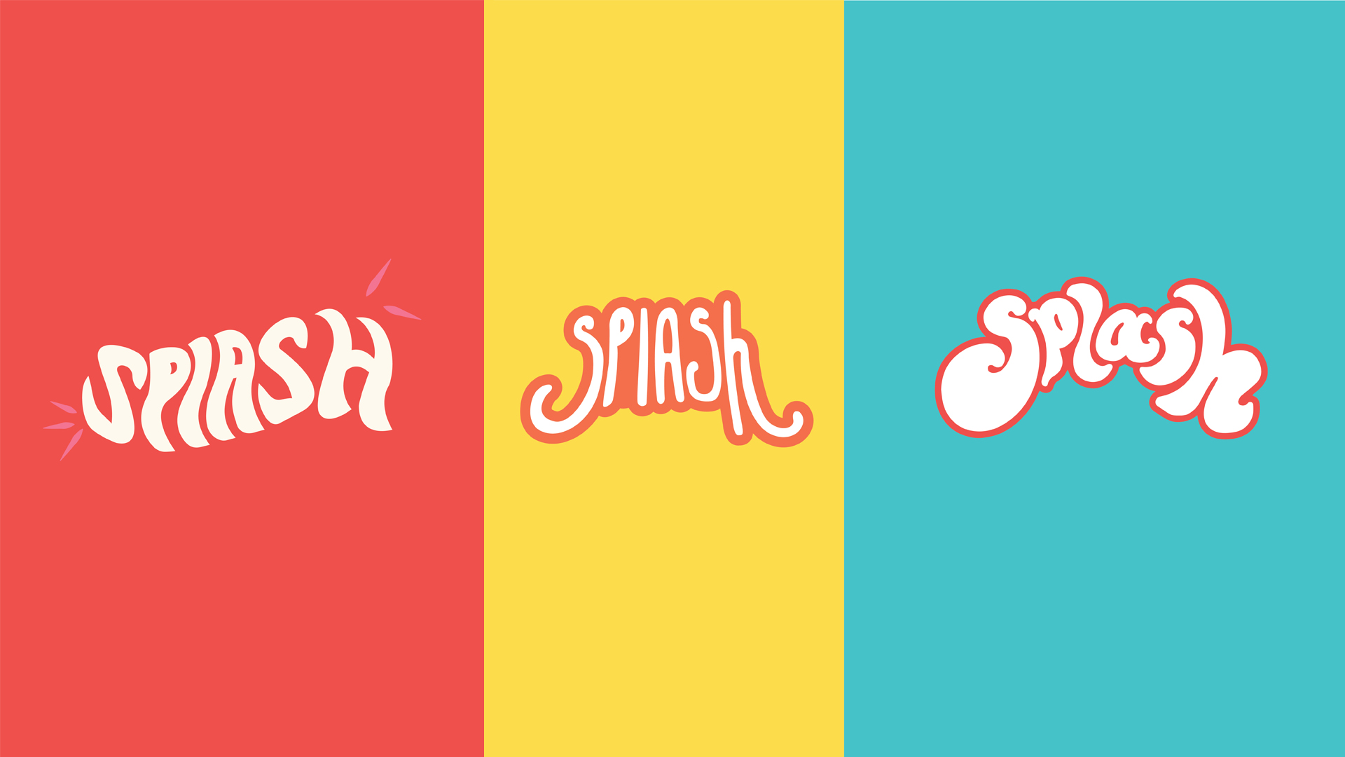
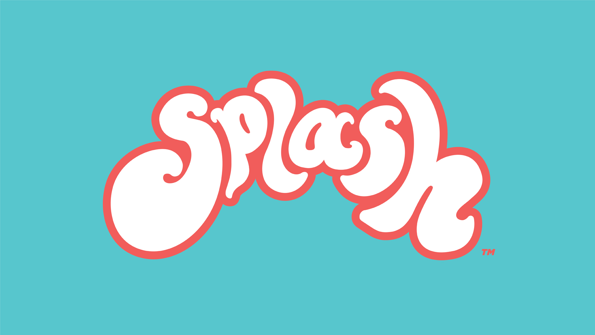
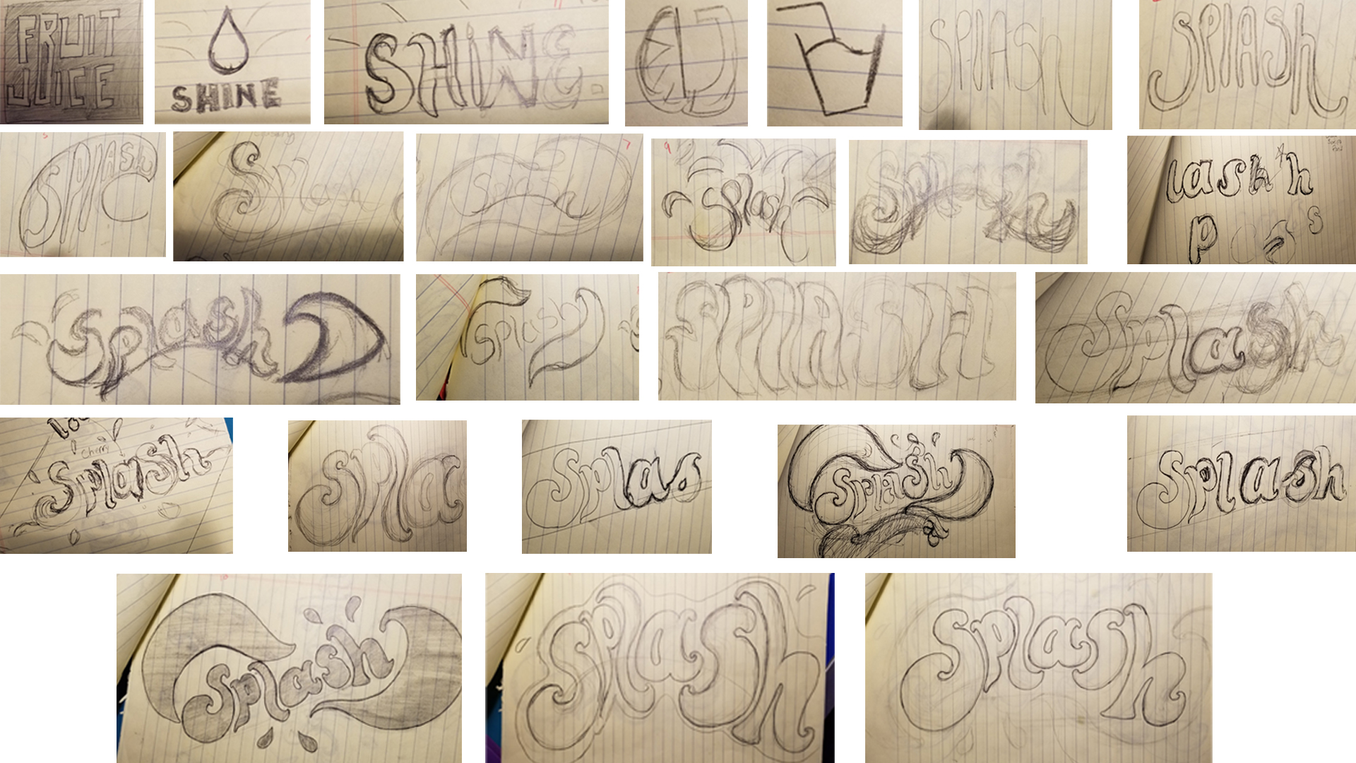
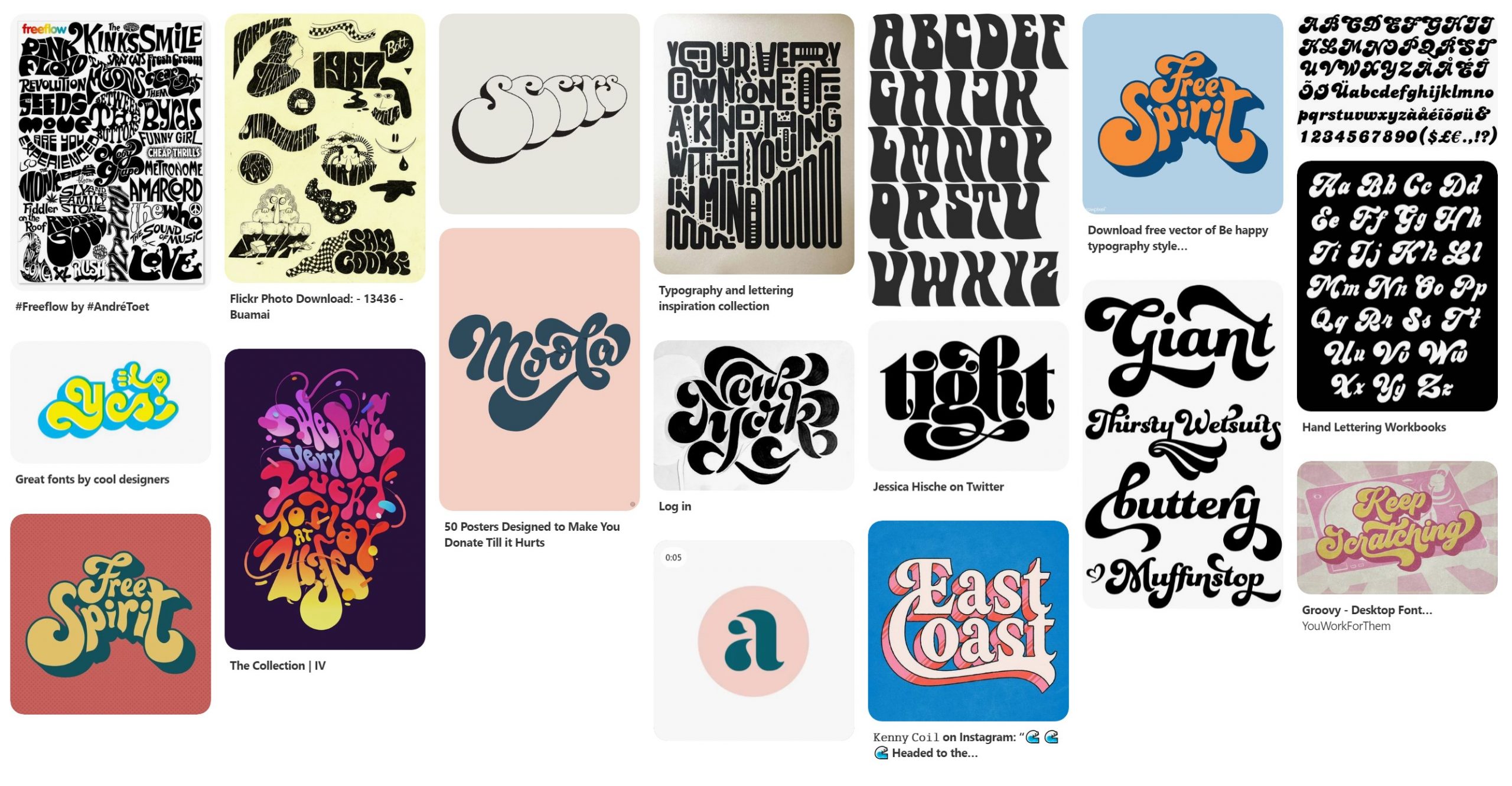
I went through a few different logo styles before I landed on the final one. The logo style communicates the energy and strong flavor of the drink as well as connects with the young audience. Through its vibrant colors, and flowing shapes of this logo clearly communicate that the product is a sweet, fruity beverage. This design impacts the audience by invoking feelings of youth, paradise, and invincibility. The final logo was all custom hand-lettered and inspired by various hand lettering styles.
.01
Branding
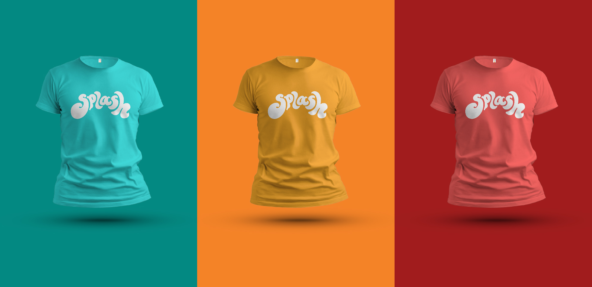
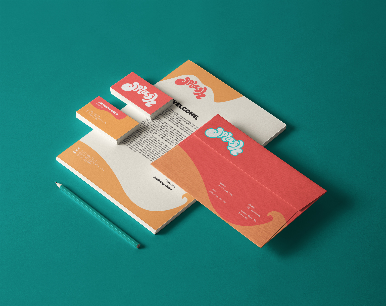
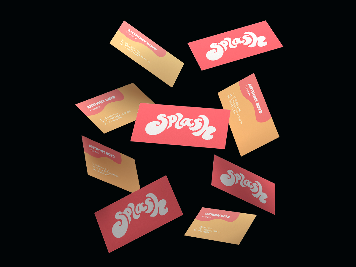
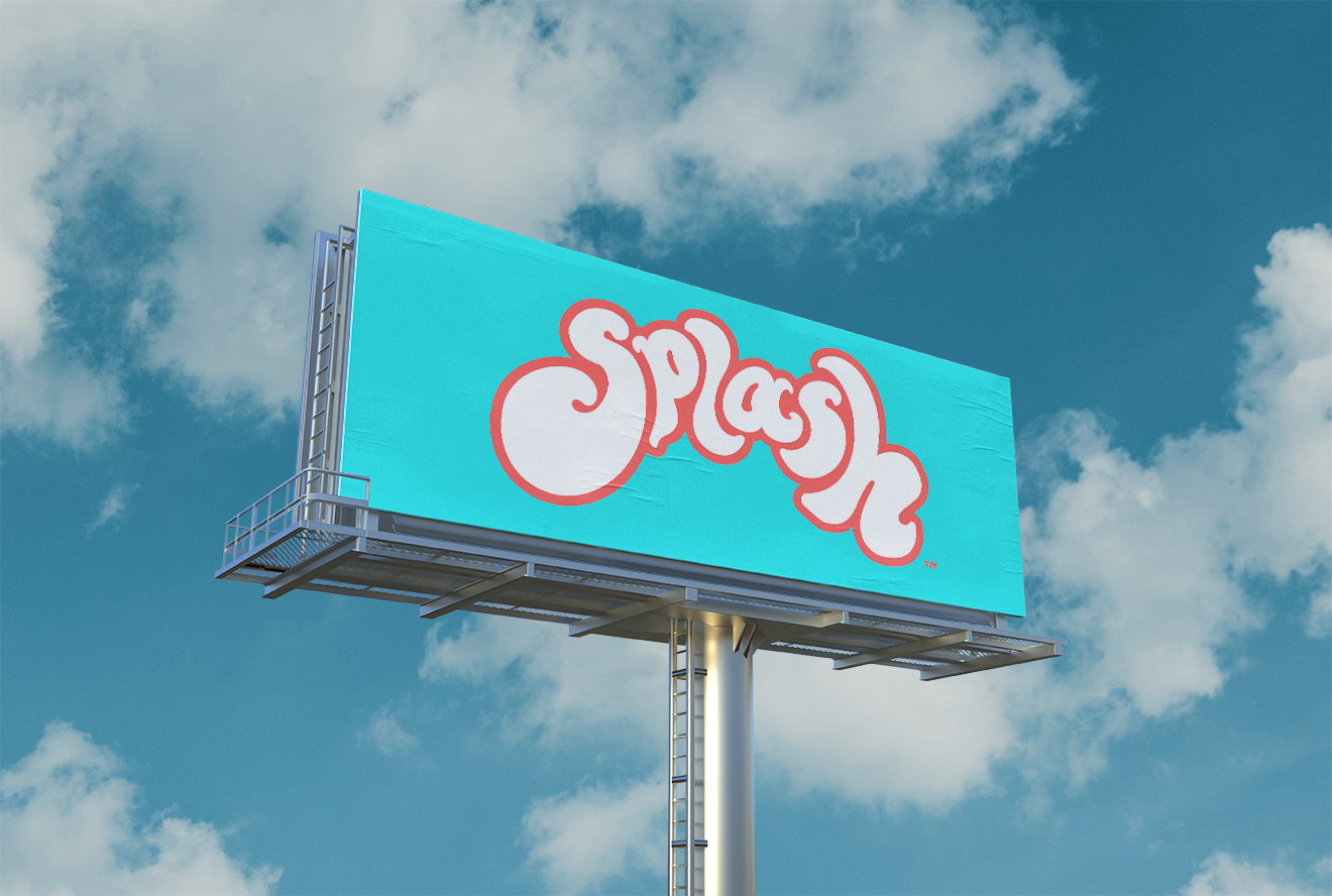
The branding stays true to the style and feel of the logo. The bright colors are continued throughout all marketing material, internal brand documents, and even merchandise. These shirts are sold online as well as in the stores where the drink is sold.

.02
Packaging + Retail
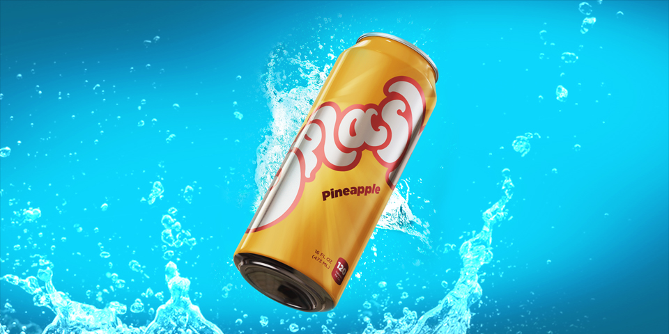
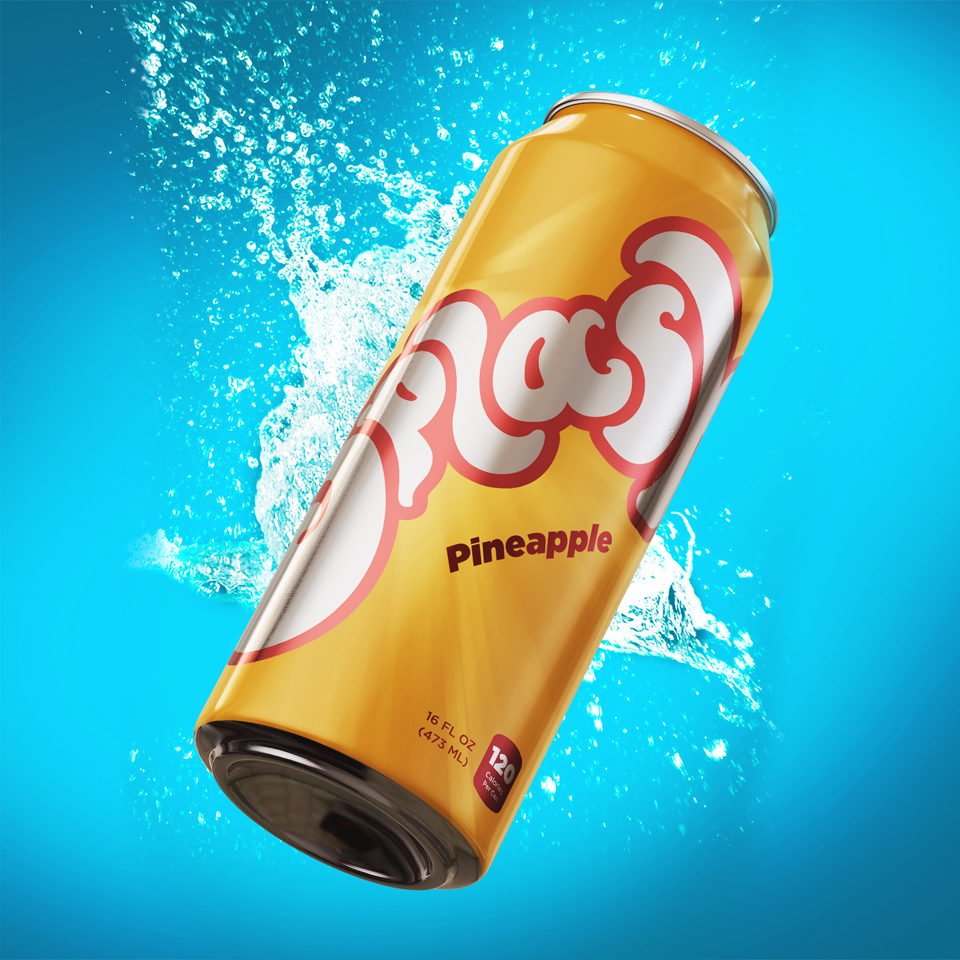
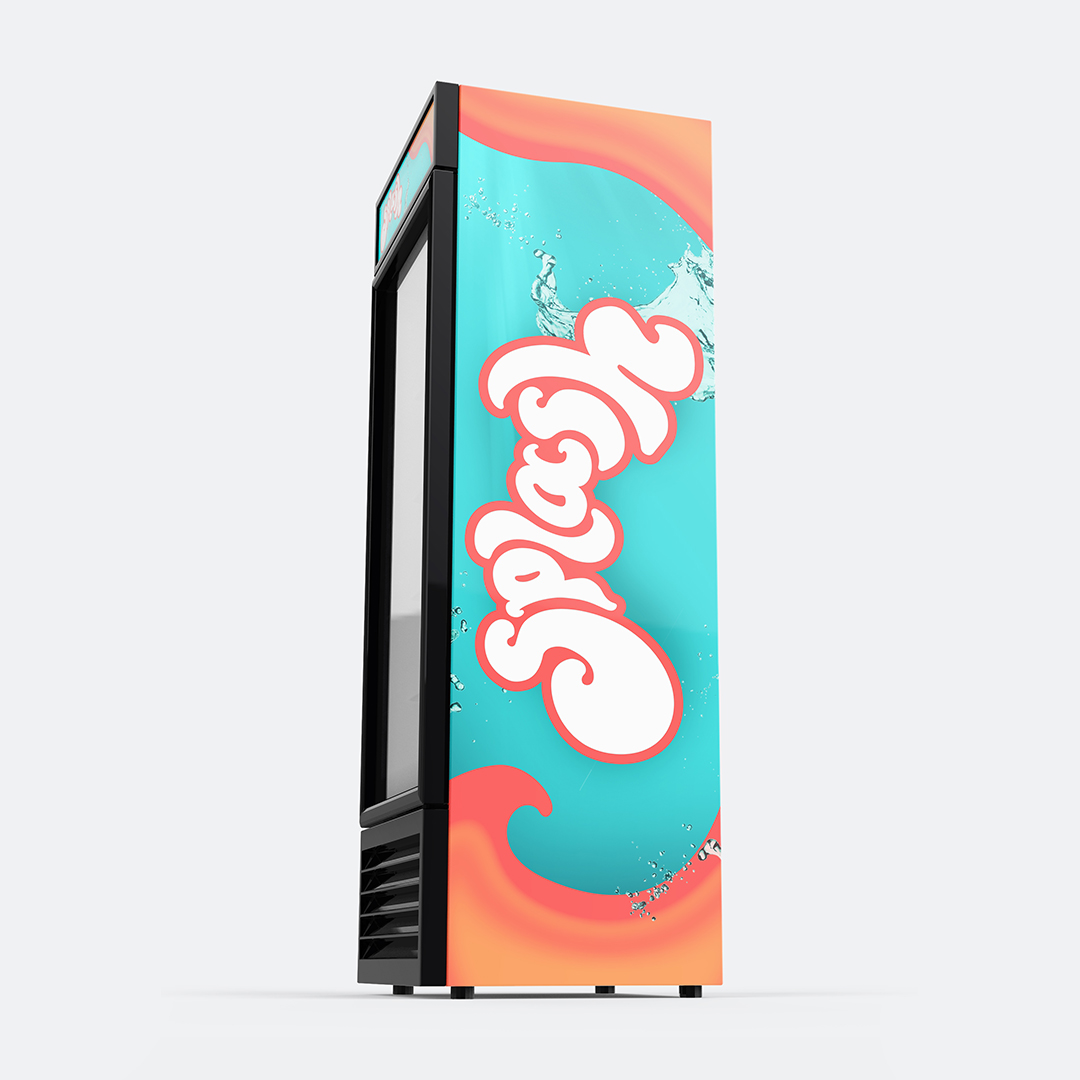
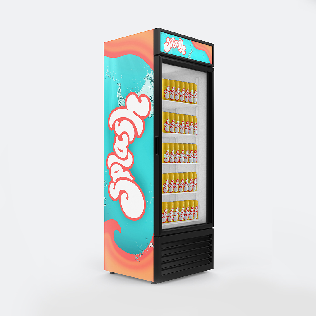
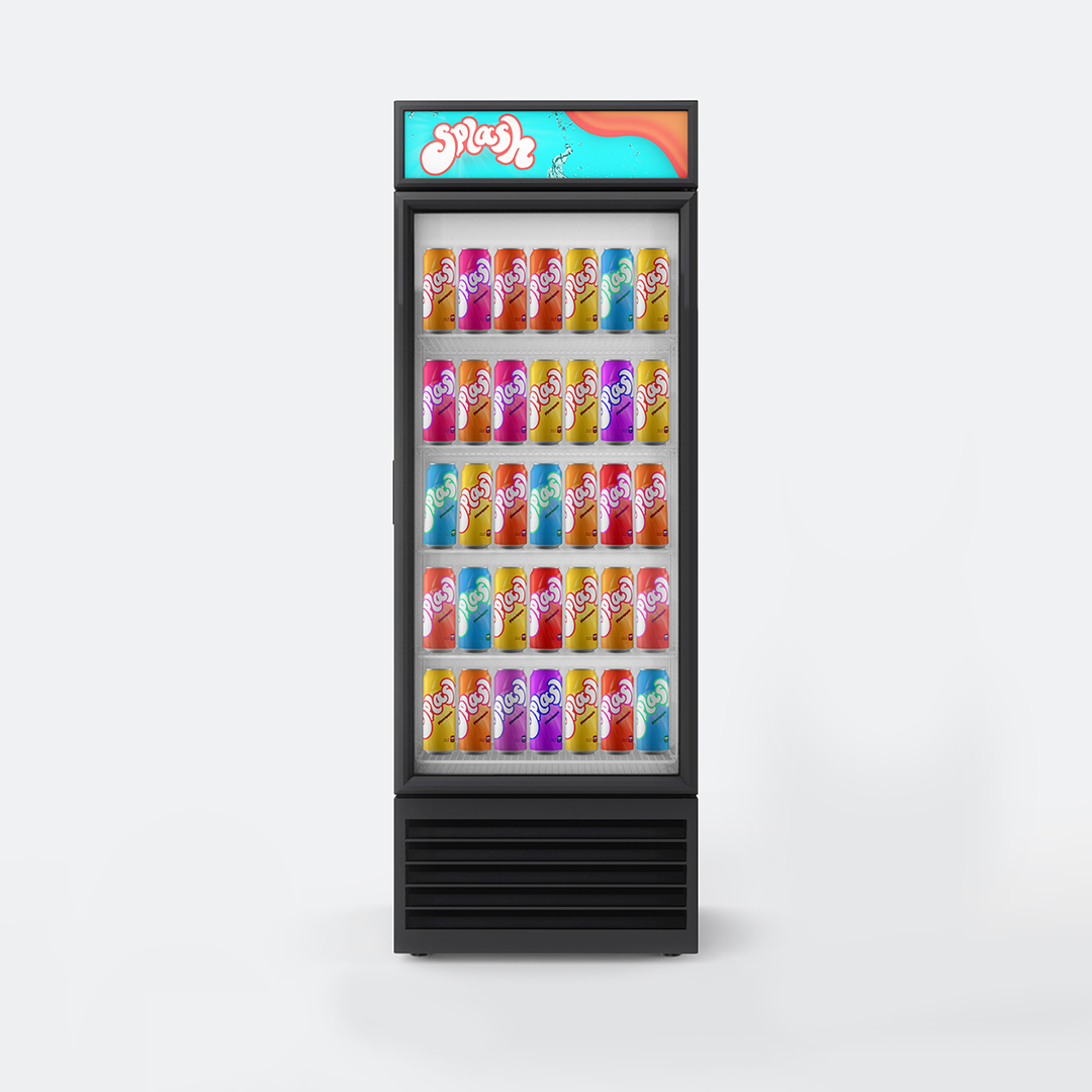
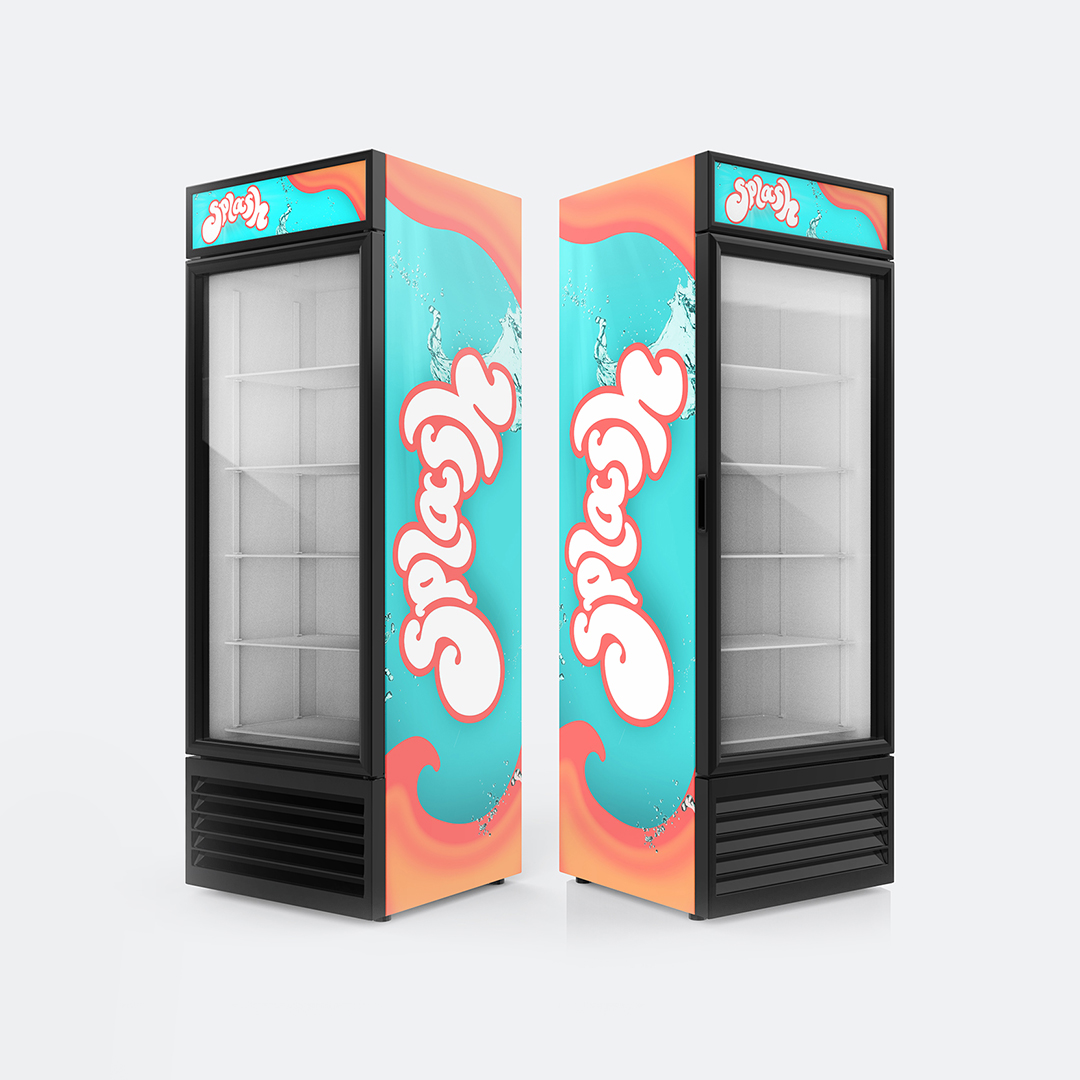
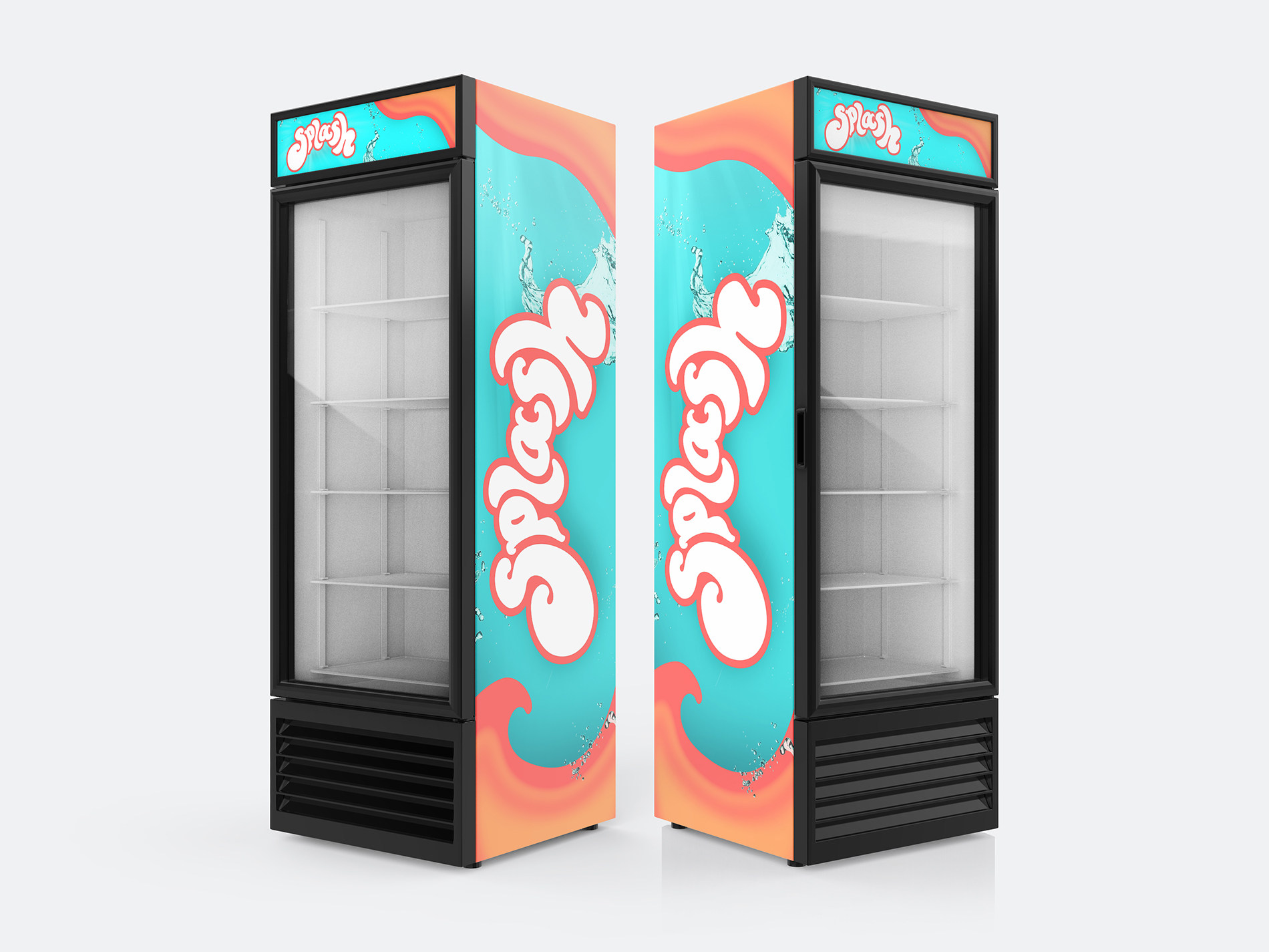
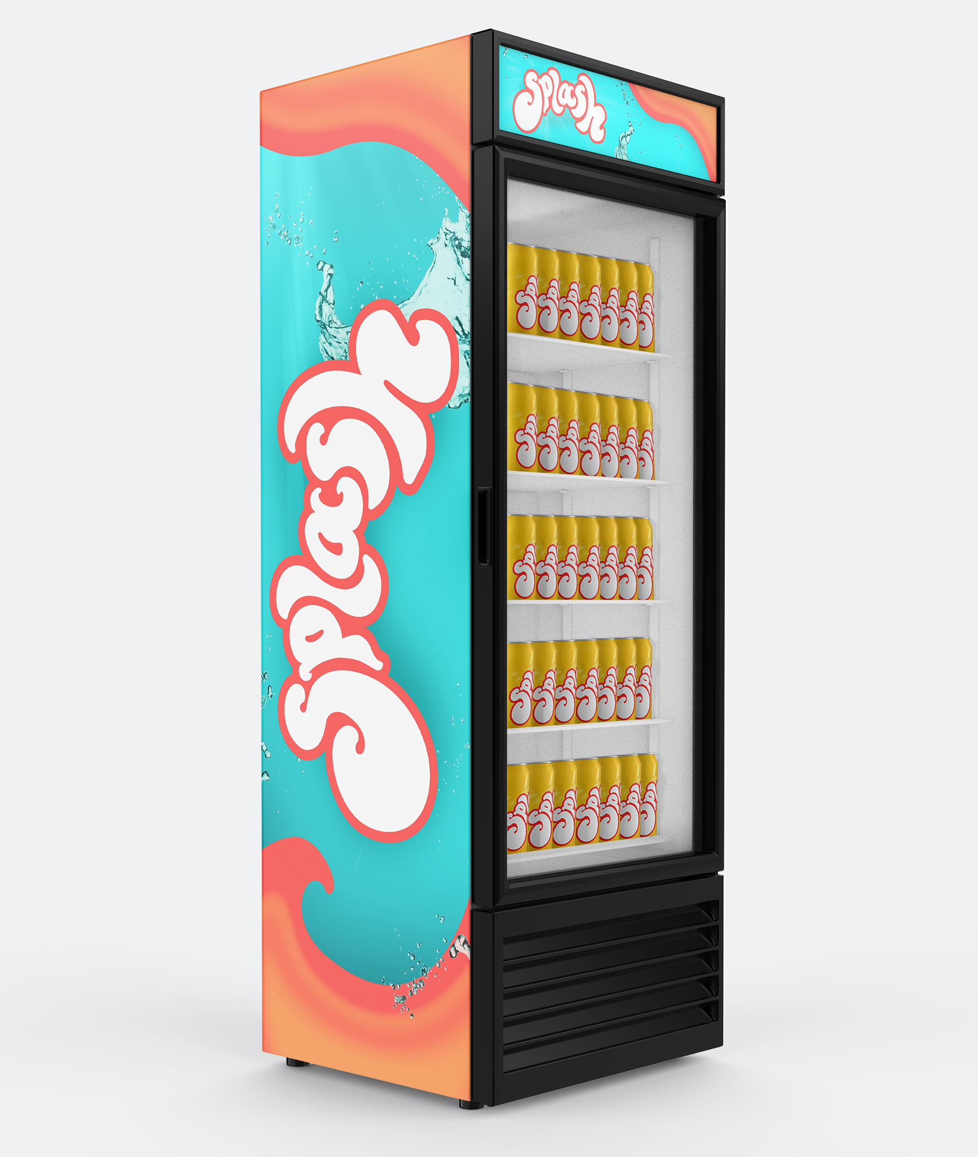
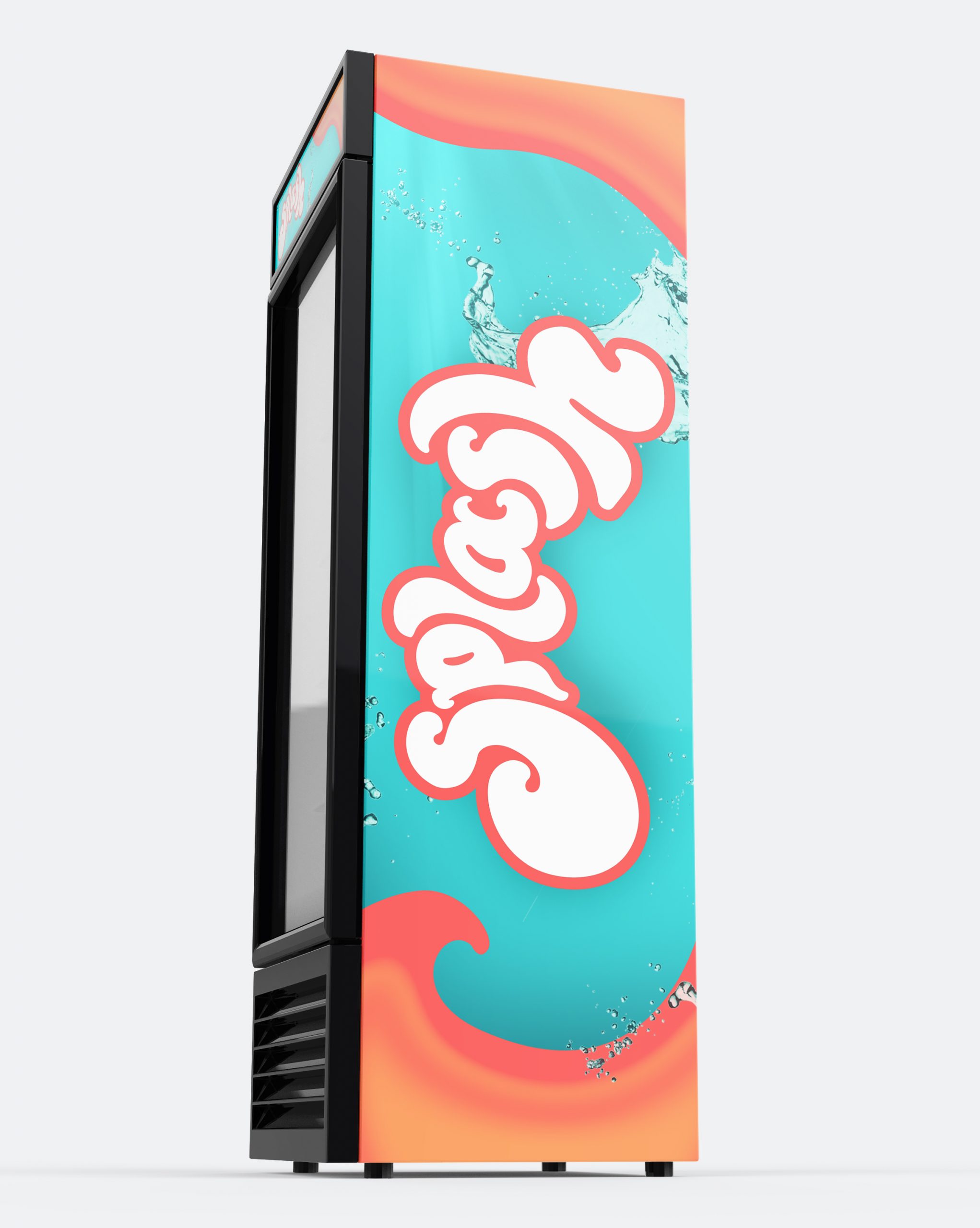
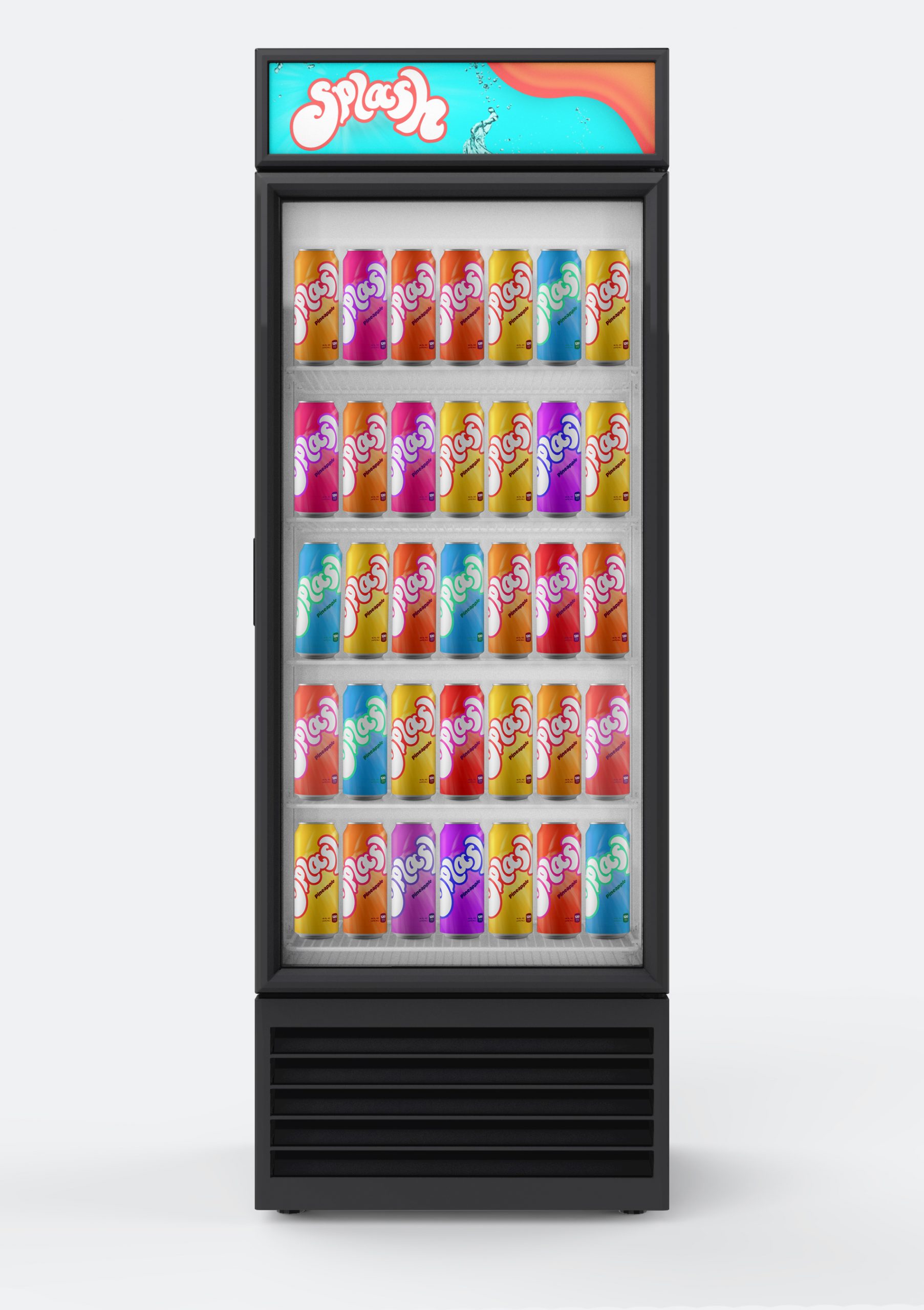
The packaging combines the logo with a bright sunburst to give feelings of sunshine, summer, and youth. Drinking Splash in the summer is sure to refresh you. The gooey orange shapes on the vending machines are expressive and fun which appeals to the young audience. They also add to the brand by having a fluid nature to them, representing the name and the product. The splashes of water in the design give a feeling of rehydration and refreshment.
Advertisement
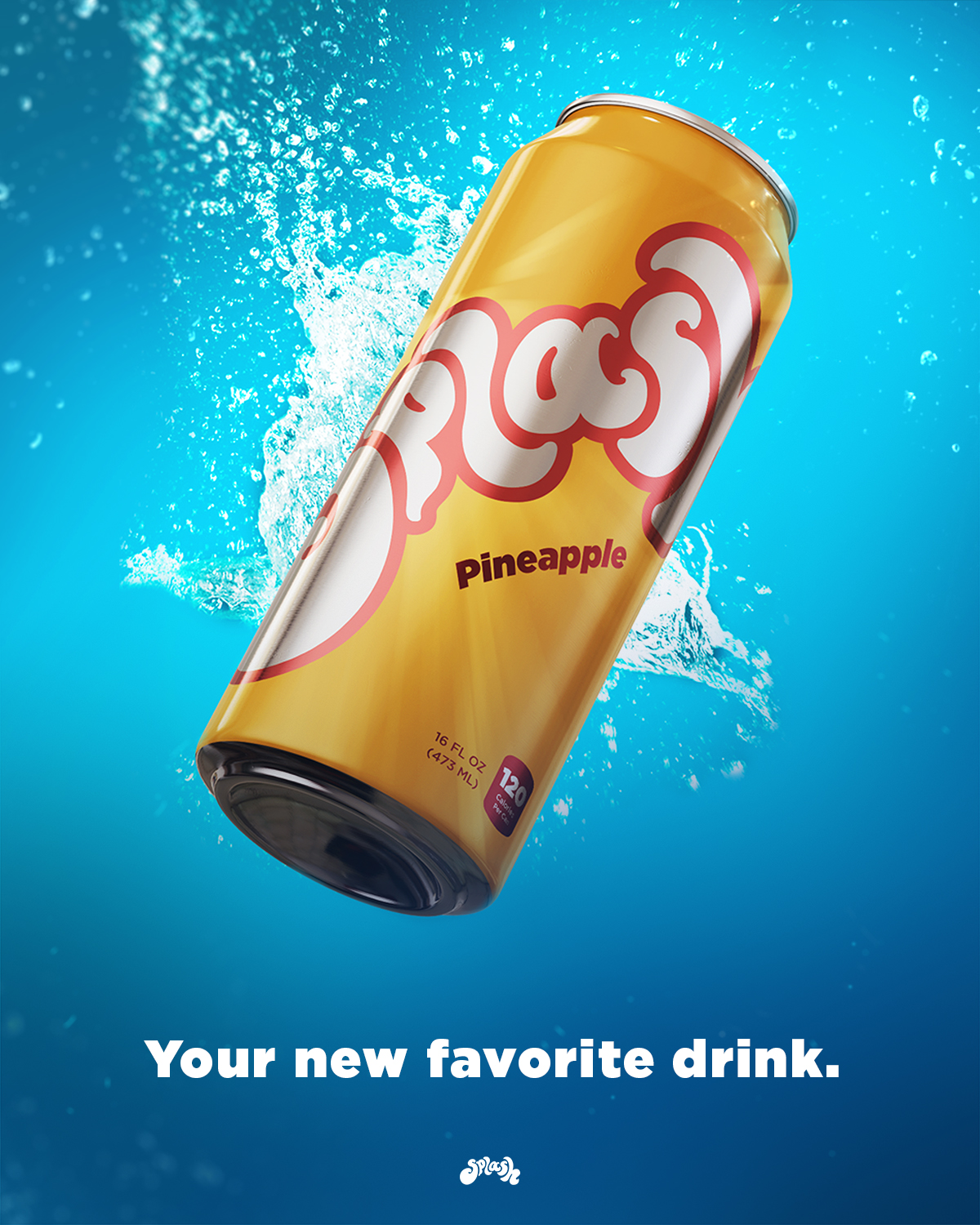
This magazine ad coins the slogan “Your new favorite drink”. This relates to the young audience and calls the viewer to action to try the drink and see what they think. The burst of water in the background visualizes the burst of flavor and refreshment felt when drinking Splash. It also emphasizes the meaning of the name.
Contacts
I provide creative solutions.
alyssanfasnacht@gmail.com
SPLASH
Brand Identity, Packaging, Animation
Client
Personal Project
SPLASH
Logo Design + Brand Identity
Splash is a fruit juice brand based in the US. This product is sold in stores, restaurants, and vending machines. The target market is youth and young adults.

Typographic Wordmark
This logo style communicate the energy and strong flavor of the drink as well as to connect with the young audience.
Vibrant Colors
Through its vibrant colors, and flowing shapes of this logo clearly communicate that the product is a sweet, fruity beverage.
Youthful feeling
This design impacts the audience by invoking feelings of youth, paradise, and invincibility.
Research


Animation
Advertisement

Retail
Identity


Apparel
